Project overview
The product:
Hangout is an application that will help users to plan there going out plans depends on their behaviours, preferences, personality, capability, age… It will suggest for users a divers choices and ideas.
The problem:
passing much time looking for good place to spent a day out limited suggestion depends on every user taste and personality
The goal:
suggestion a go out plan depends: profile, location, budget, accompany, theme … reservation, directions, notes and reviews all in few steps
My role:
UX designer designing an Hangout app from conception to delivery.
Responsibilities:
Conducting interviews, paper and digital wireframing, low and high-fidelity prototyping, conducting usability studies, accounting for accessibility, and iterating on designs.
Understanding the user
User research
Summary:
conducted interviews and created empathy maps to understand the users I’m designing for and their needs. A primary user group identified through research was different ages users who likes to plan their going out program. The group of users they admit the usability of hangout app, but not only spending much time searching on different platform is the issue. Other user problem is quality, organisation and avoiding unpleasant surprises is a must for them.
Pain points
Pain point
Users who spent a lot of time searching for a program for there hangouts.
Pain point
Users who can’t found places depends on their likes and their personality
Pain point
user problem is quality, organisation and avoiding unpleasant surprises is a must for them.
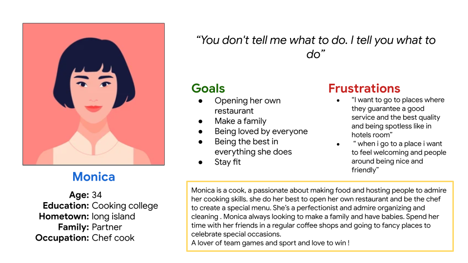
Persona: Monica
Problem statement:
Monica is a Perfectionist cook who needs An organized, honest and varied app planner because Browsing on different platform does not guarantee the quality and time that needs for her going out program
User journey map
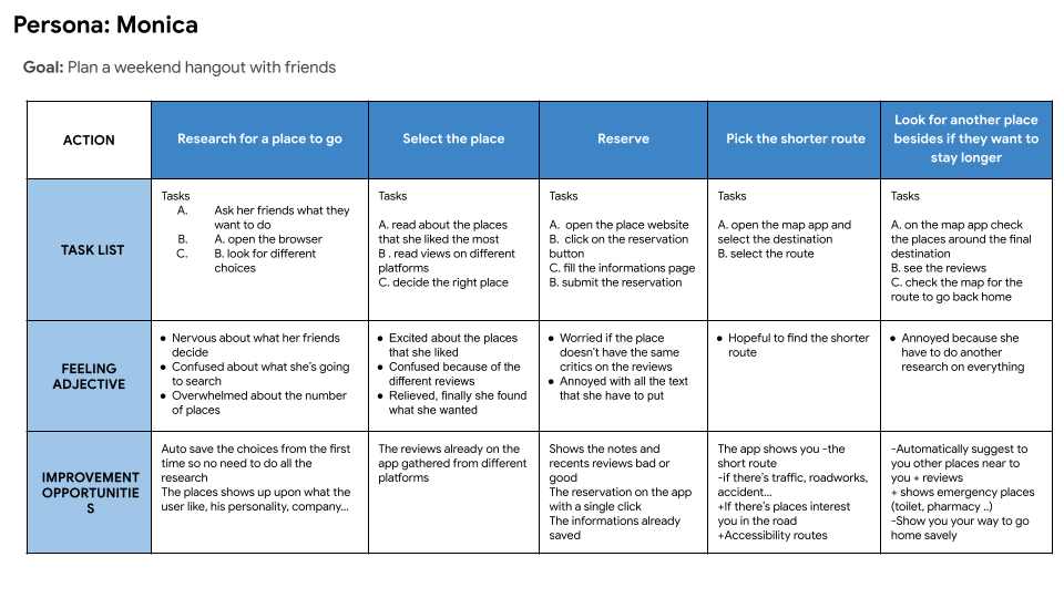
Mapping Monica’s user journey revealed how helpful it would be for users to have access to Hangout app to make it easy and fast.
Starting the design
Paper wireframes
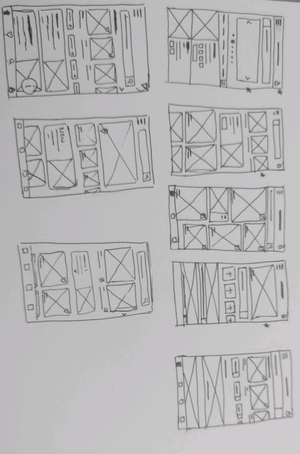
Taking the time to draft iterations of each screen of the app on paper ensured that the elements that made it to digital wireframes would be well-suited to address user pain points.
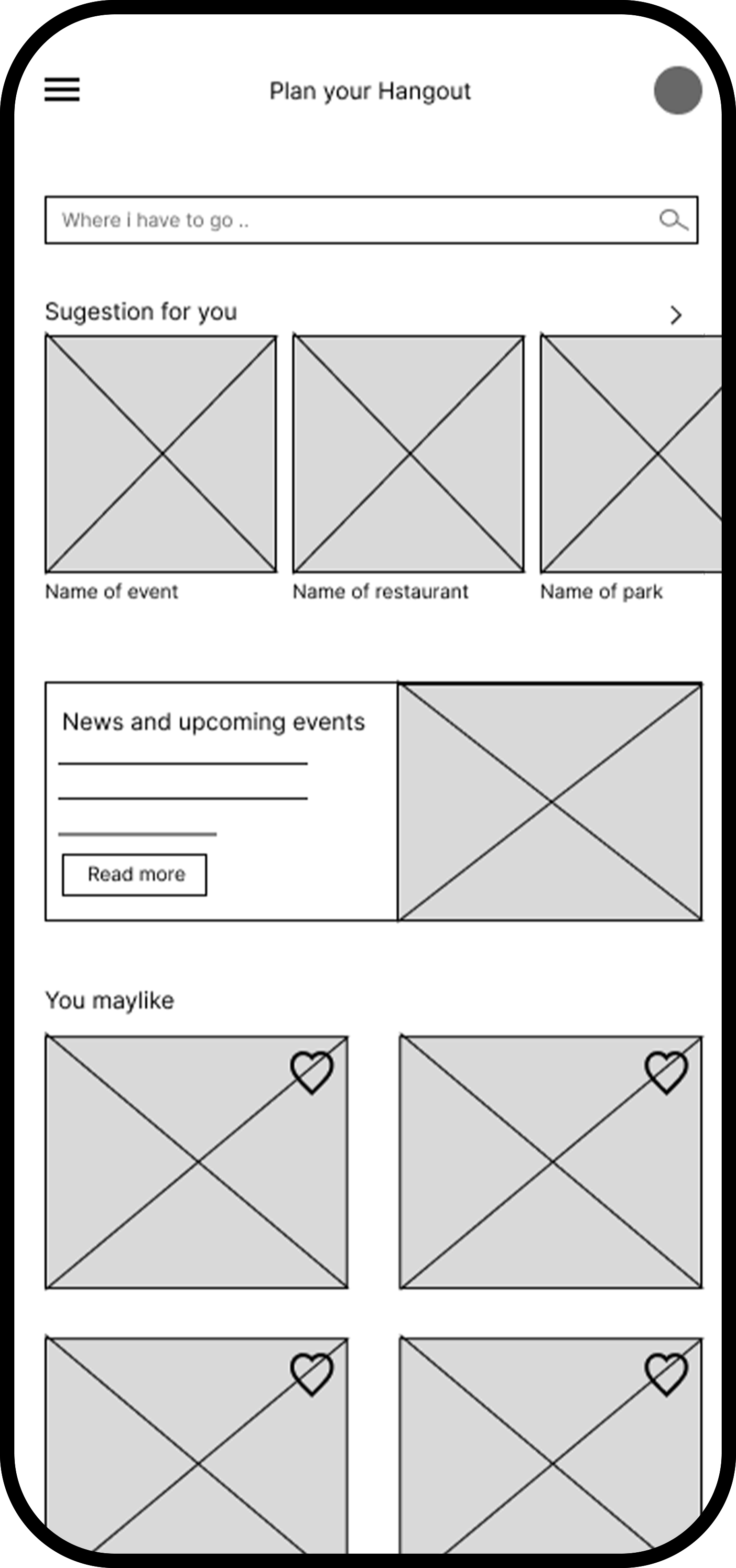
Digital wireframes
At the first wireframe i made sure to make the first page easy and accessible
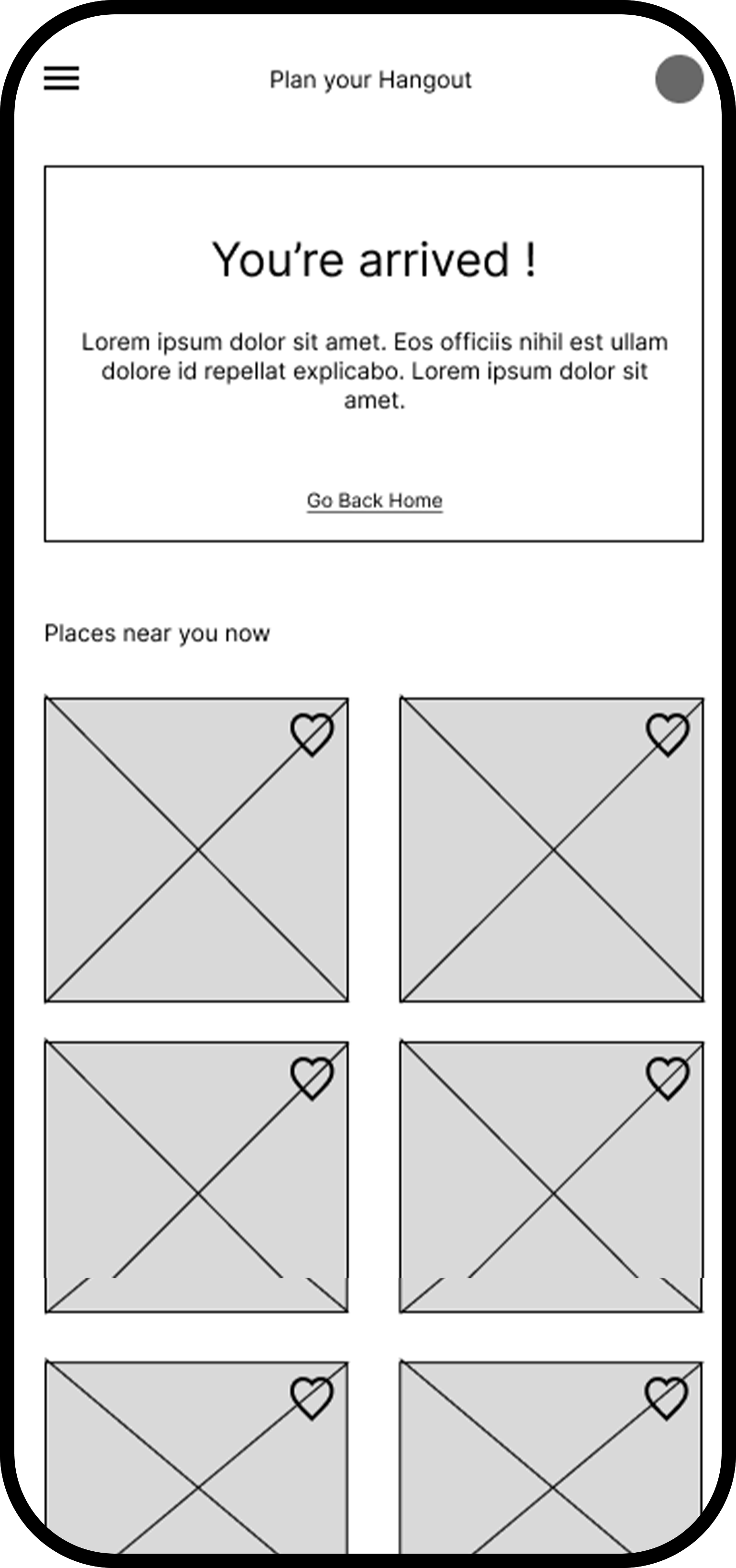
Digital wireframe
Using a friendly tone is a key user need to address by and an easy navigation is added in the design to equipping the app to work with assistive tec.
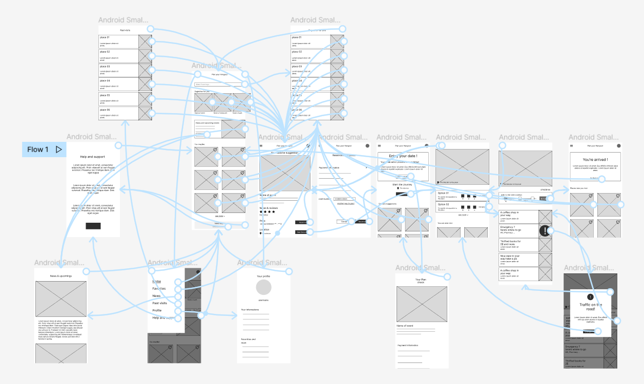
Low-fidelity prototype
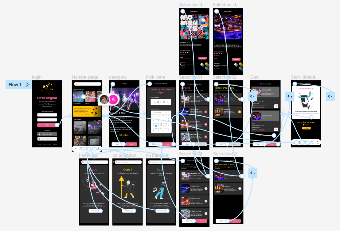
Using the completed set of digital wireframes, I created a low-fidelity prototype.
Test Low-fidelity PrototypeUsability study:
Parameters
Study type:
Unmoderated usability study
Participants:
7 participants
Length:
20-30 minutes
Location:
Paris, France
Usability study: findings
These were the main findings uncovered by the usability study:
Ordering
on the order screen, users don’t have a way to pick more than one date
Product
users can’t mix flowers in the same pot
checkout
during the checkout process users can’t easily change the address of shipping
Refining the design
Mockups
After the usability study the home page had a lot of information that made the user did not know from where to start
Before usability study

After usability study
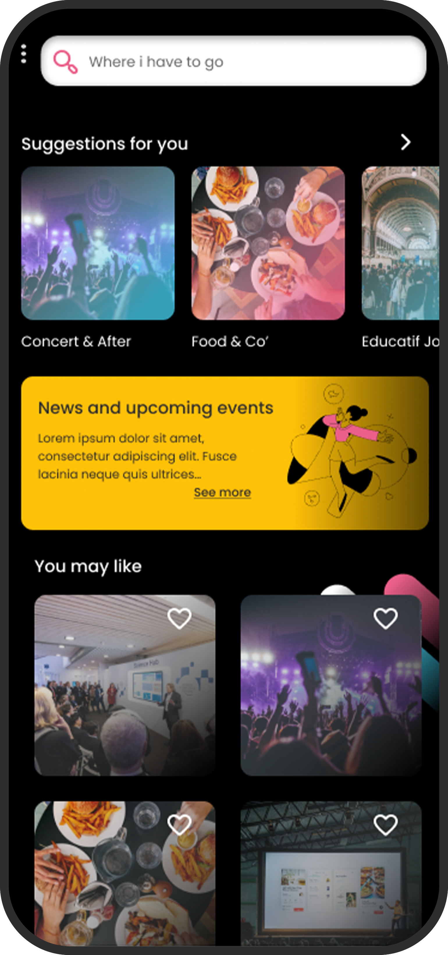
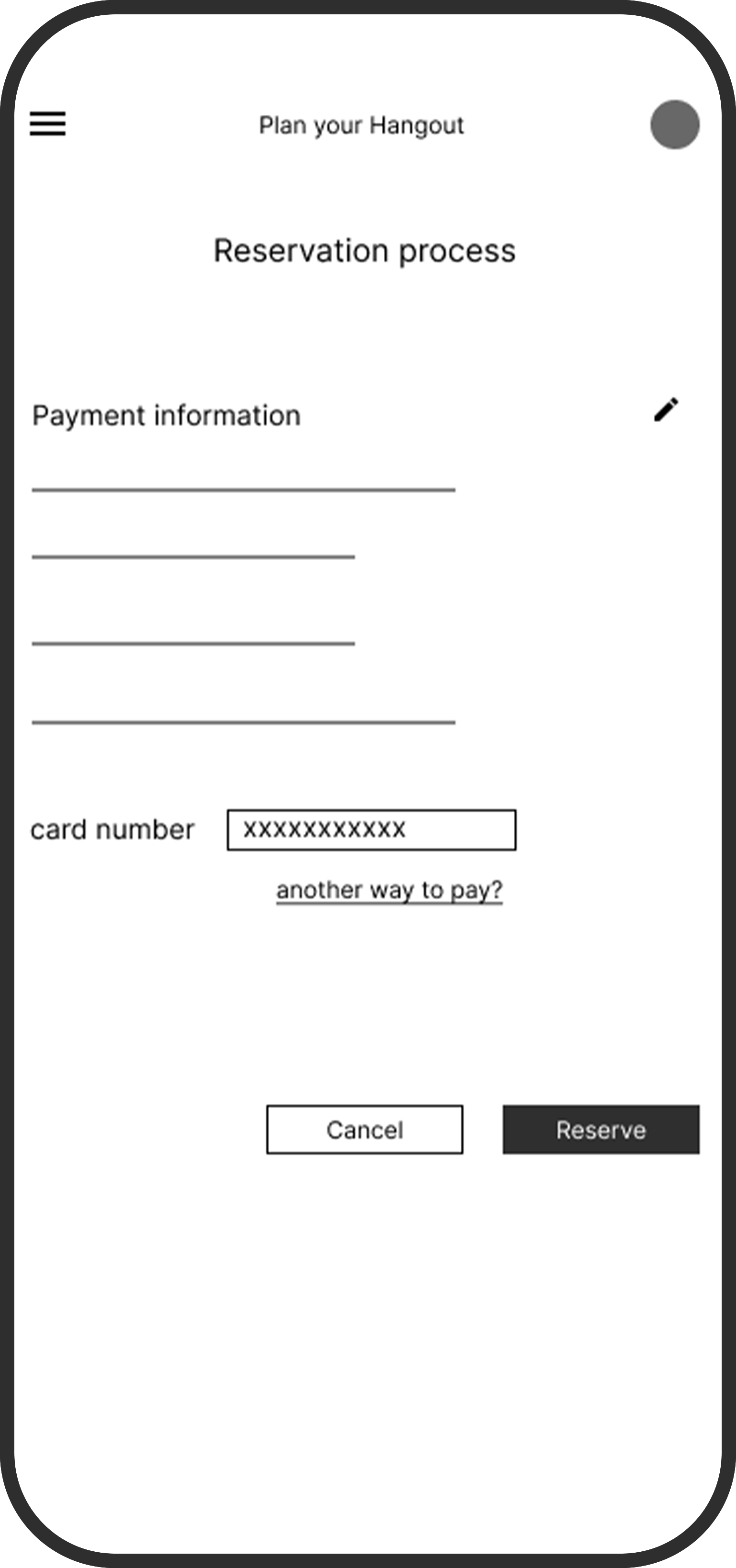
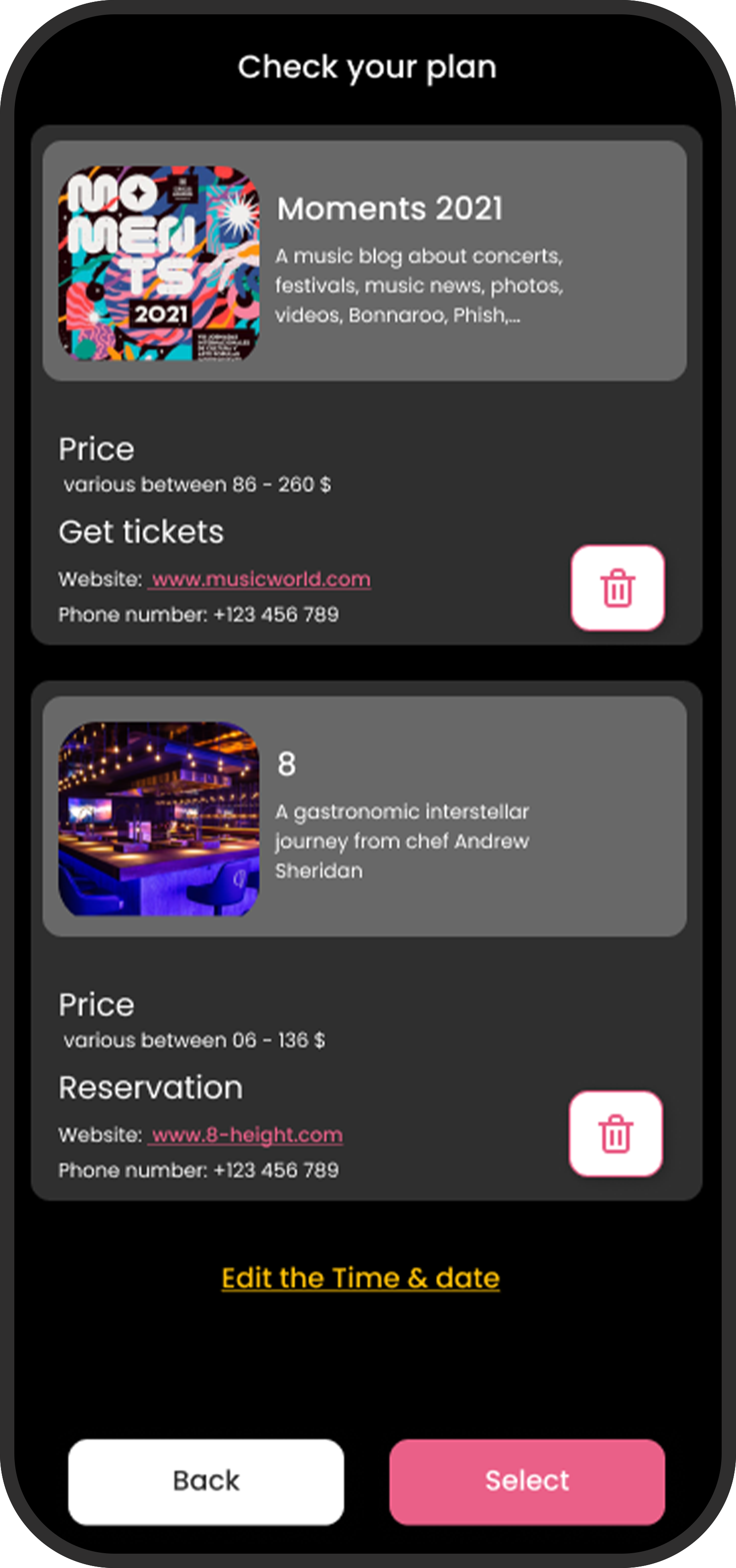
At first i made a page for reservation. But after the study and a lot of research and observation i realised that its a it complicated to make the reservation by the app so i add another page that you’ll find the contact and made a reservation out of the app, but the app will plan for you and remind you of your program and instruct you of what you need to do.
Before usability study
After usability study
High-fidelity prototype
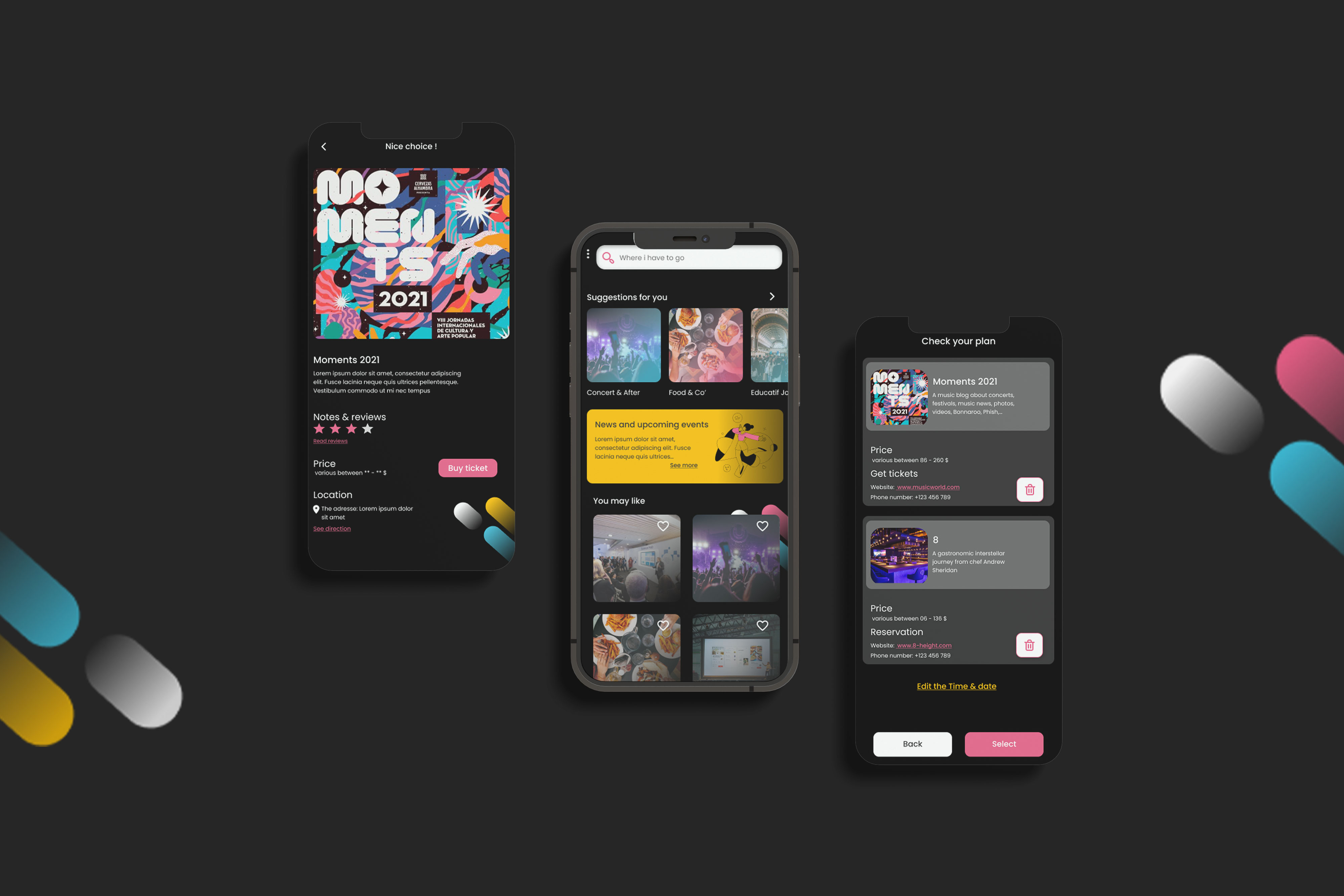
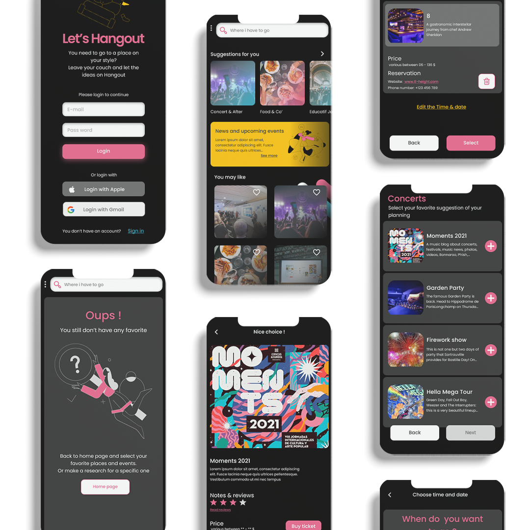
The high fidelity mockup of the hangout app
Accessibility considerations
Provided access to users who are vision impaired through adding alt text to images for screen readers.
Used icons to help make navigation easier.
Used detailed imagery for events and places to help all users better understand the designs.