Project overview
The product:
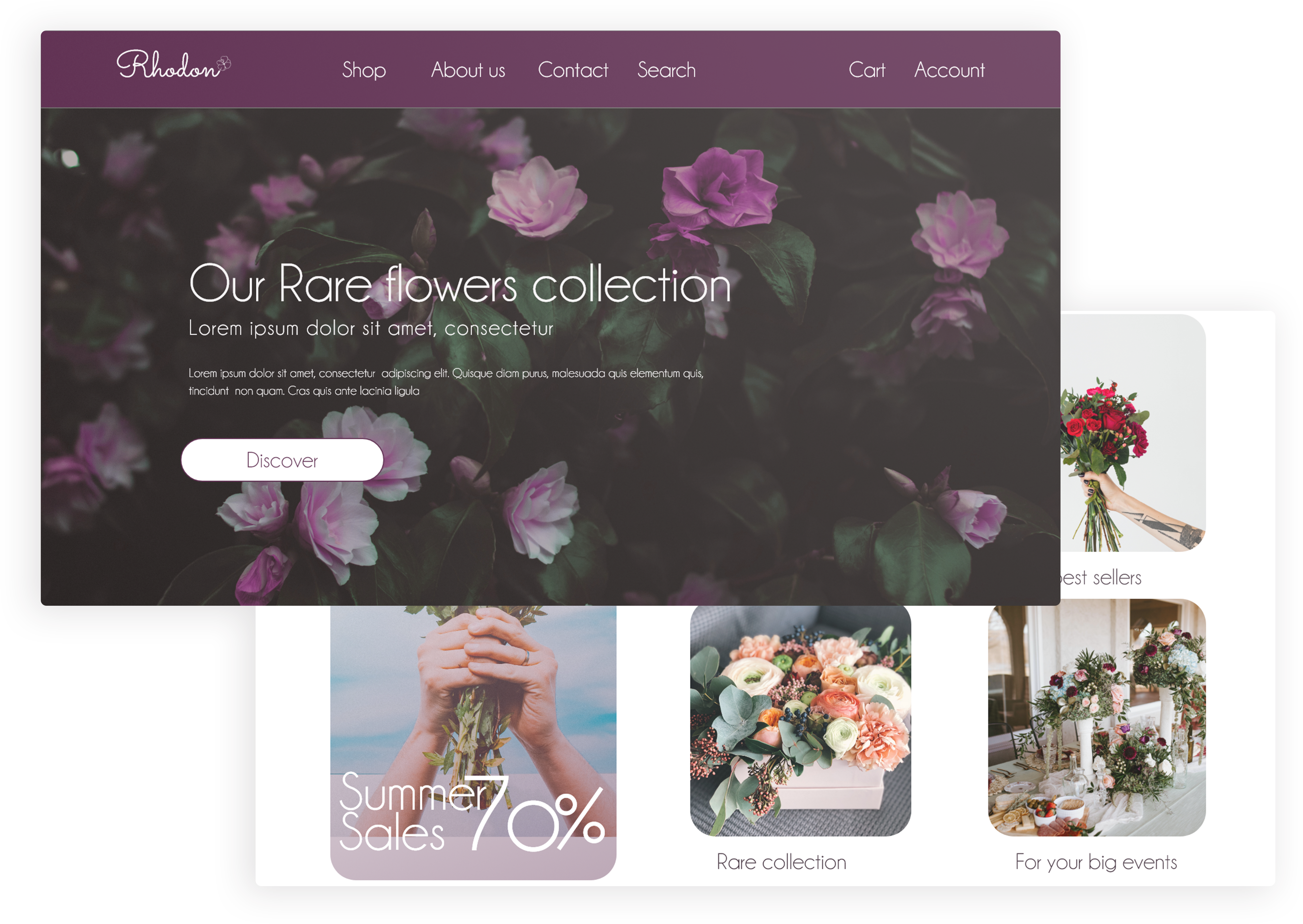
Rhodon is a trendy flowers shop that offers a variety of flowers category. The typical user is between 18-70 years old, and the users are random people get flowers for their homes, shops, gift occasions and for business needs. Rhoden goal is to make flower ordering fun, fast, and easy for all types of users.
The problem:
Available online ordering websites have unreal photo of flowers orders, limited option while ordering and checking, and long process of making the right choice especially when sending flowers as a gift
The goal:
Design Rhodon website to be user friendly by providing clear navigation and offering a fast checkout process.
My role:
UX designer leading the Rhodon website design
Responsibilities:
Conducting interviews, paper and digital wireframing, low and high-fidelity prototyping, conducting usability studies, accounting for accessibility, iterating on designs and responsive design.
Understanding the user
User research
Summary:
I conducted user interviews, which I then turned into empathy maps to better understand the target user and their needs. I discovered that many target users treat online ordering as a part of their jobs activity when they need a quick task for ordering flowers and guarantee the delivery. However, many shopping websites are overwhelming and don’t show the final product that will be delivered, which frustrated many target users. This caused an experience to become challenging for them, defeating the purpose of their goal.
Pain points
Navigation:
Flowers ordering website designs are often empty and not clear, which results in confusing navigation Lack of information
Interaction
Disarranged content in flowers ordering websites make item selection difficult, which sometimes leads users to make mistakes
Experience
Flowers ordering websites don’t provide an engaging browsing experience
Persona: Jessica
Problem statement:
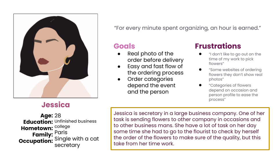
Jessica is a busy secretary who needs A fast ordering process and honest quality flowers because Going to a local florist and checking the flowers quality, takes so much time of her work
User journey map
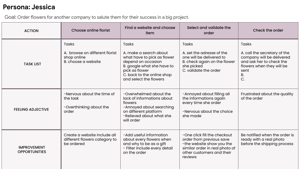
I created a user journey map of Jessica’s experience using the site to help identify possible pain points and improvement opportunities. .
Starting the design
Sitemap
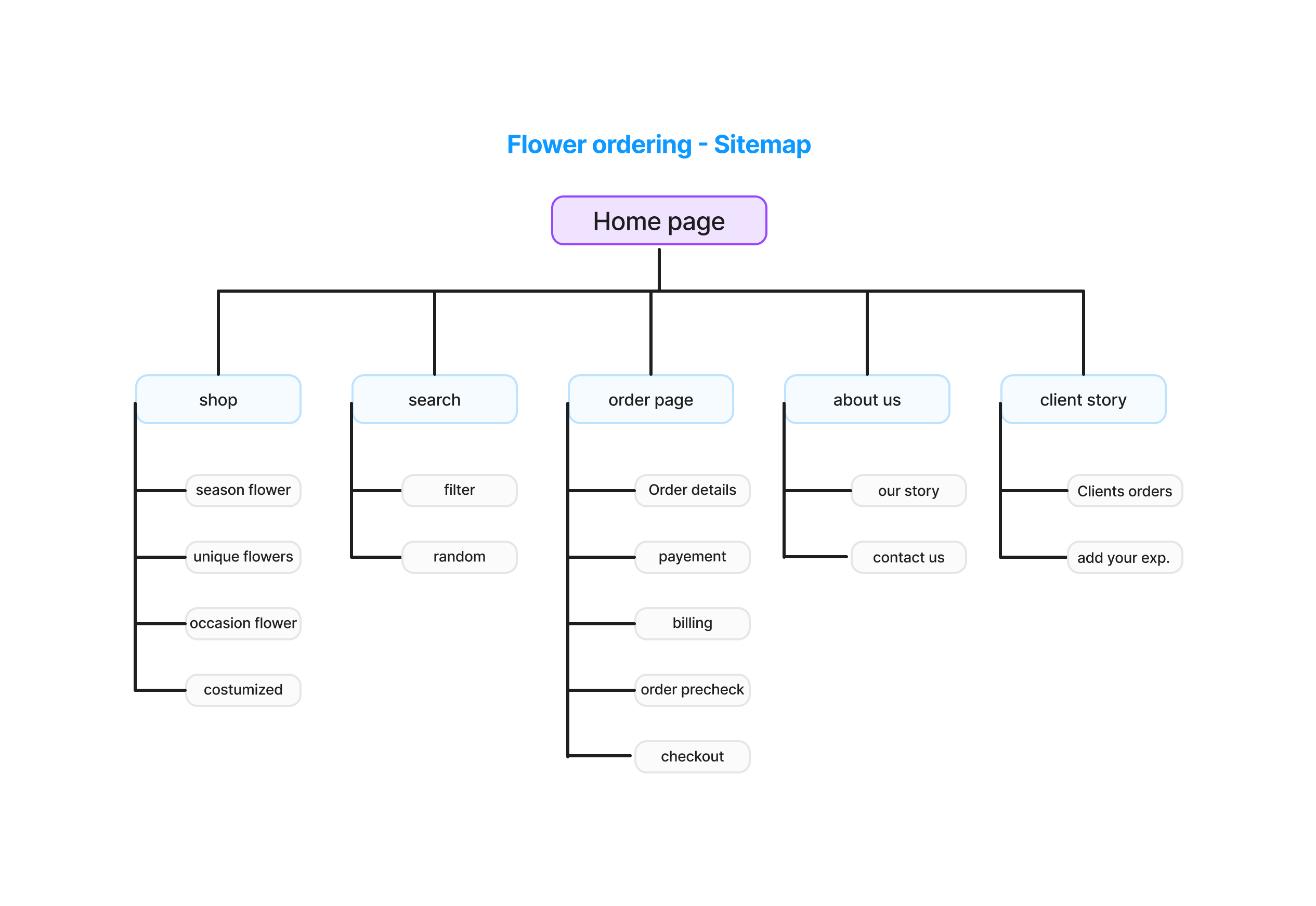
My goal here was to make the process easy and clear with no complication for the users. Also i worked on strategic information architecture decisions that would improve overall website navigation. The structure I chose was designed to make things simple and easy.
Paper wireframes
Here i sketched out paper wireframes for each screen in my app, keeping the user pain points about navigation, browsing, and checkout flow in mind.
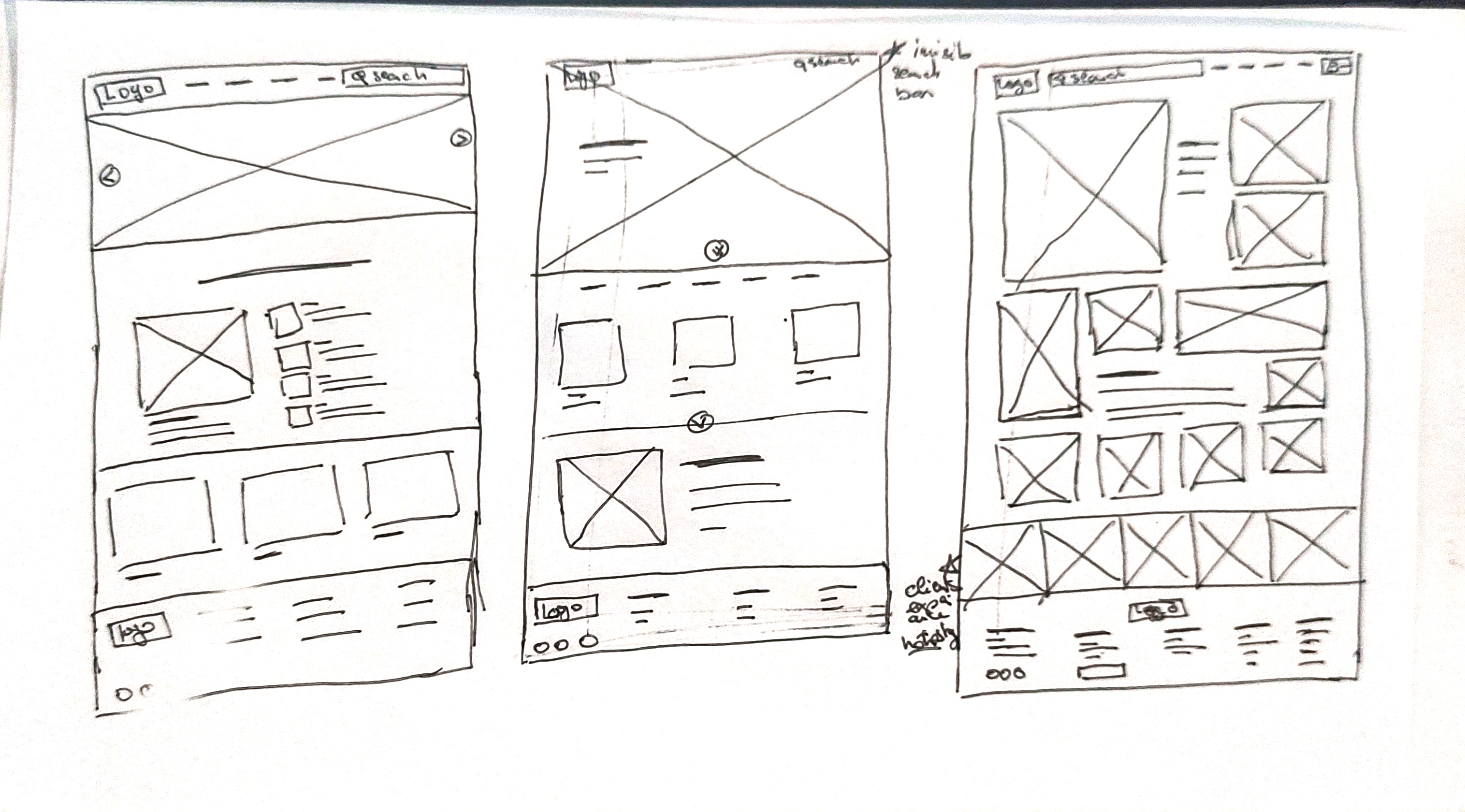
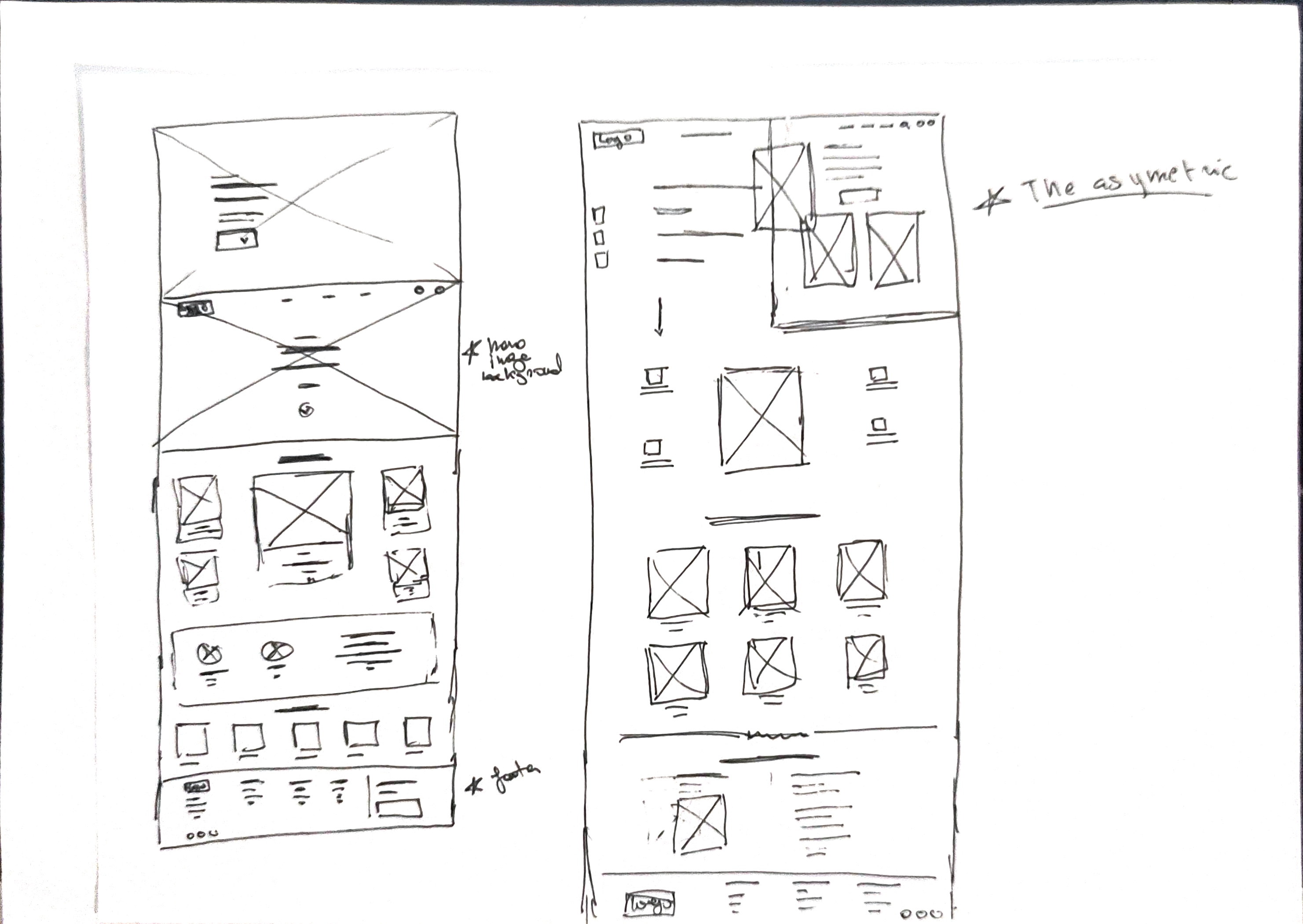
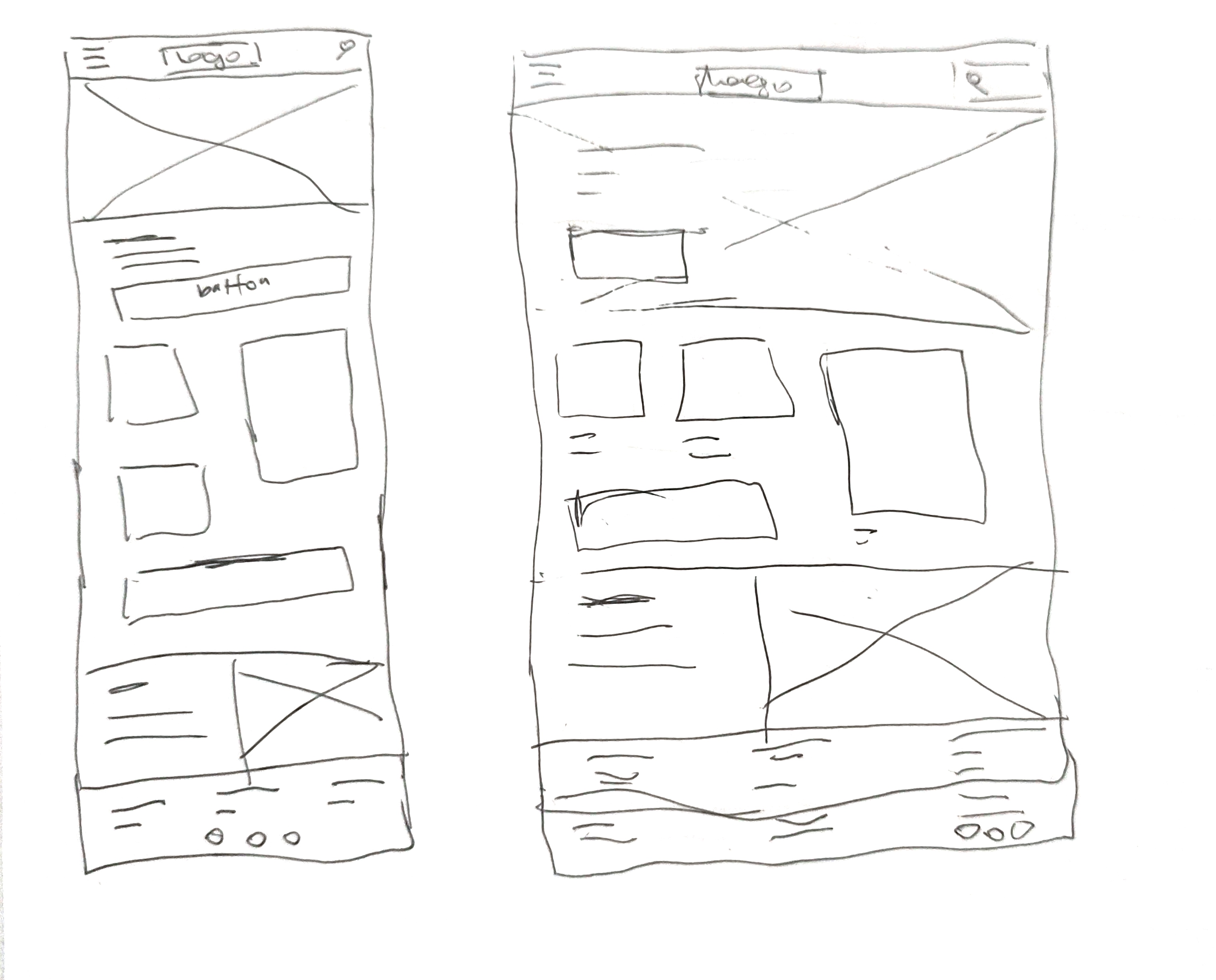
screen size variations
I worked on designs for additional screen sizes to make sure the site would be fully responsive. (mobile and tablet)
Digital wireframes
After finishing the paper wireframes i moved to digital wireframes, it’s easy to understand how the redesign could help address user pain points and improve the user experience. The key part of my strategy is prioritizing useful button locations and visual element placement on the home page.
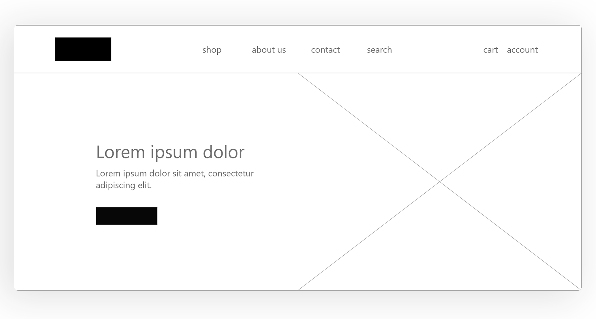
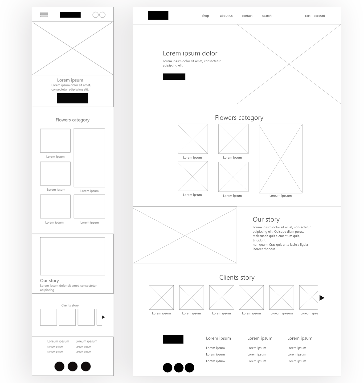
Digital wireframe screen size variation(s)
Low-fidelity prototype
To create a low-fidelity prototype, I connected all of the screens involved in the primary user flow of adding an item to the cart and checking out. And depending on peers feedback i made a lot of changing to make the process more useful and simple.
Test Low-fidelity PrototypeUsability study:
Parameters
Study type:
Unmoderated usability study
Participants:
7 participants
Length:
20-30 minutes
Location:
Paris, France
Usability study: findings
These were the main findings uncovered by the usability study:
Ordering
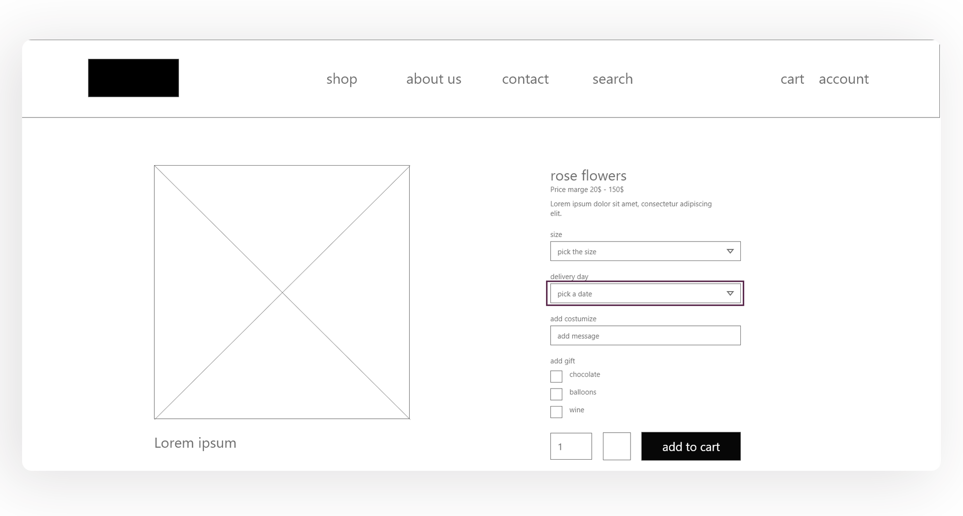
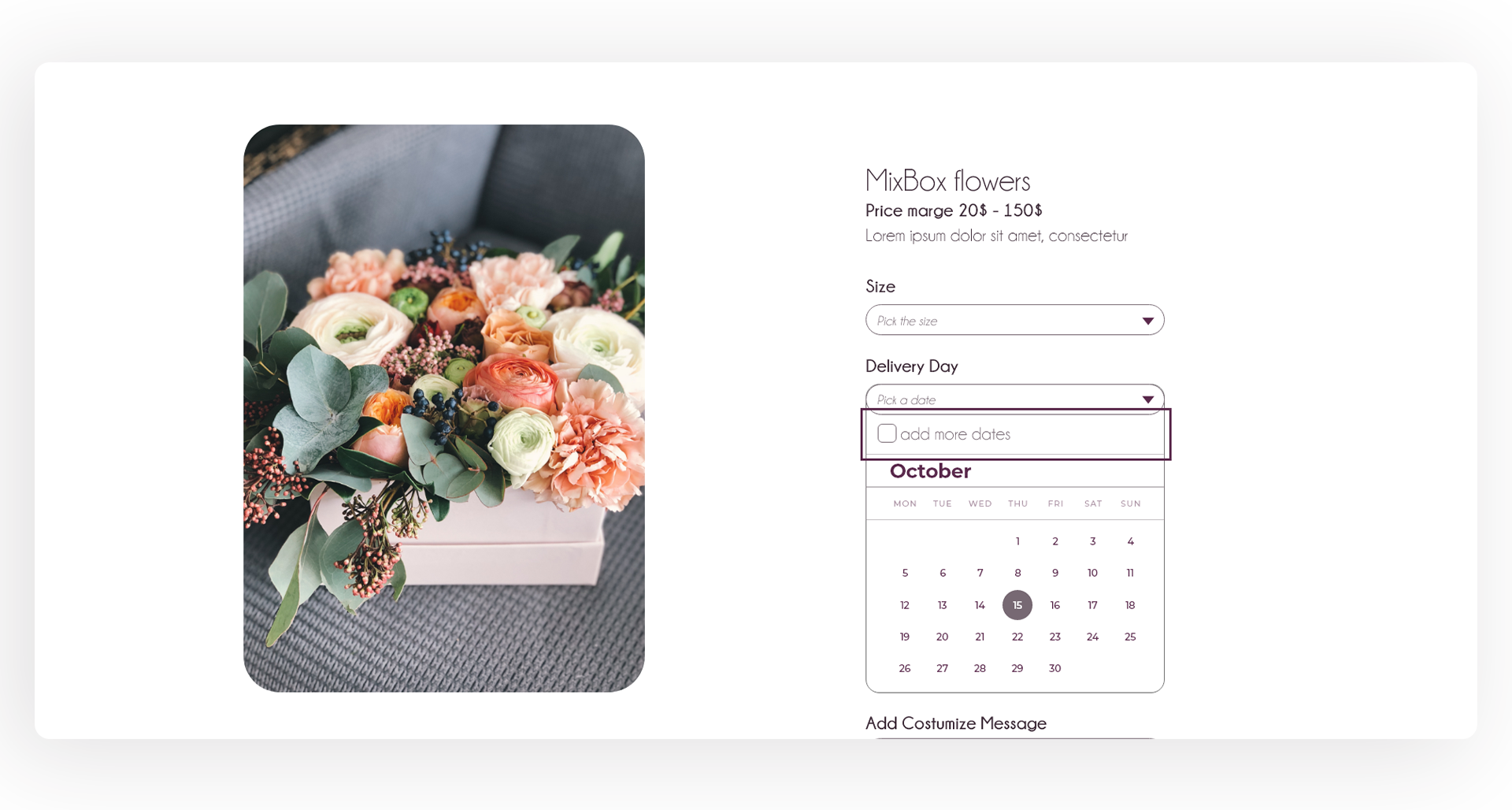
on the order screen, users don’t have a way to pick more than one date
Product
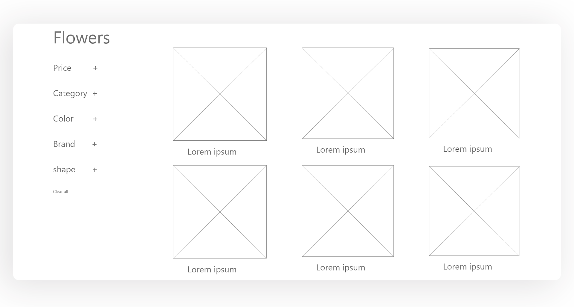
users can’t mix flowers in the same pot
checkout
during the checkout process users can’t easily change the address of shipping
Refining the design
Mockups
Based on the insights from the usability study, I made changes to improve the site’s checkout flow. One of the changes I made was adding the option to add more than one date for ordering . This allowed users more freedom to full a calendar and add different dates for ordering and shipping.
Before usability study
After usability study
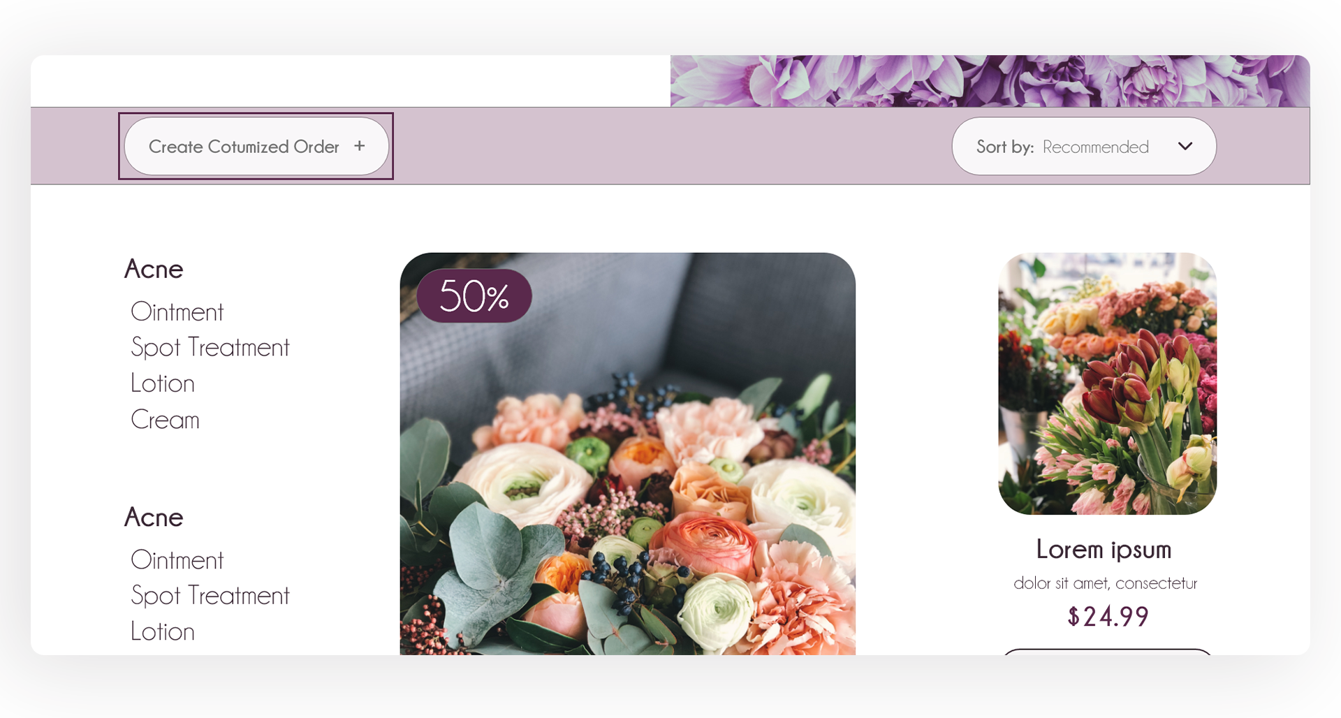
To make an order with mixed flowers, i add a button to create customized order to make the choices more variante for the users.
Before usability study
After usability study
Screen size variations
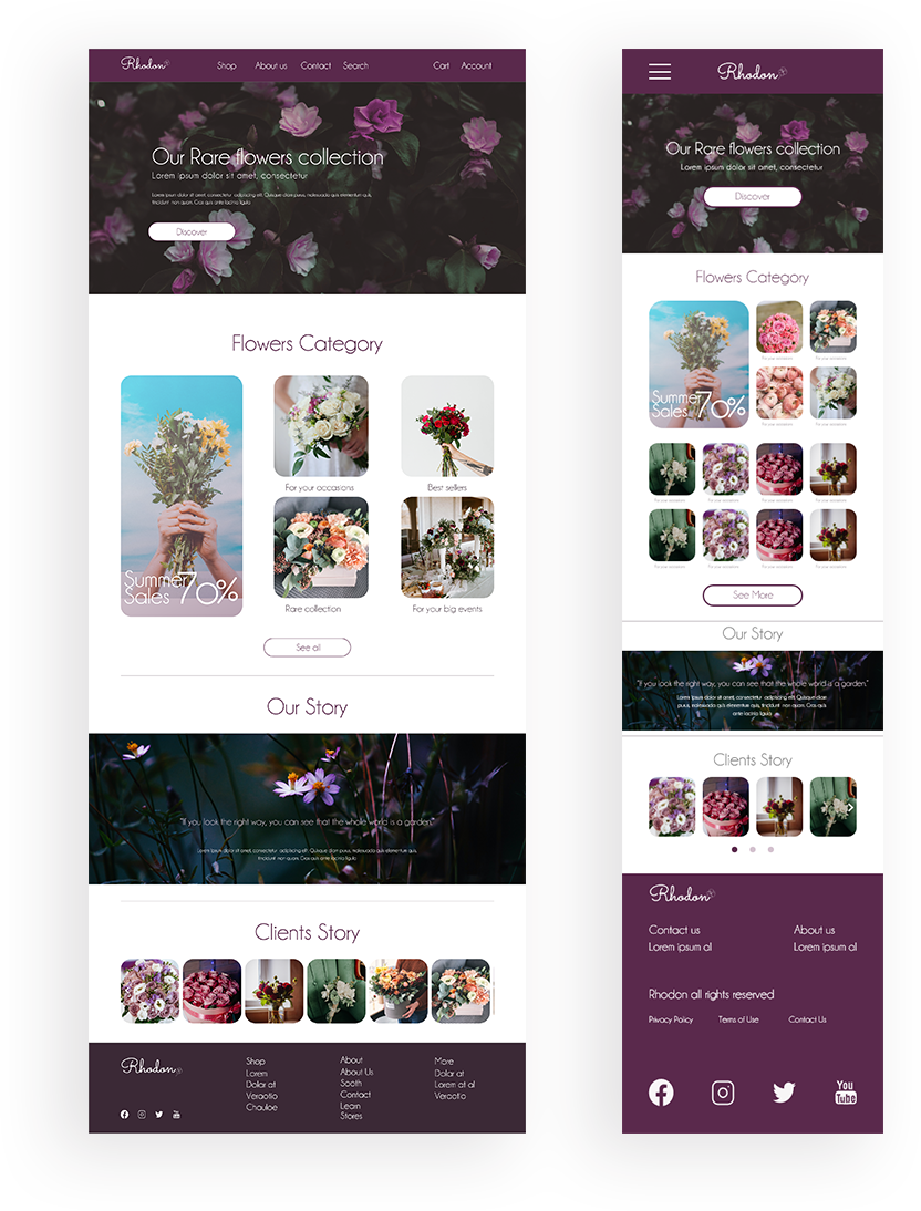
I included considerations for additional screen sizes in my mockups based on my earlier wireframes. Because users shop from a variety of devices, I felt it was important to optimize the browsing experience for a range of device sizes, such as mobile and tablet so users have the smoothest experience possible.
High-fidelity prototype
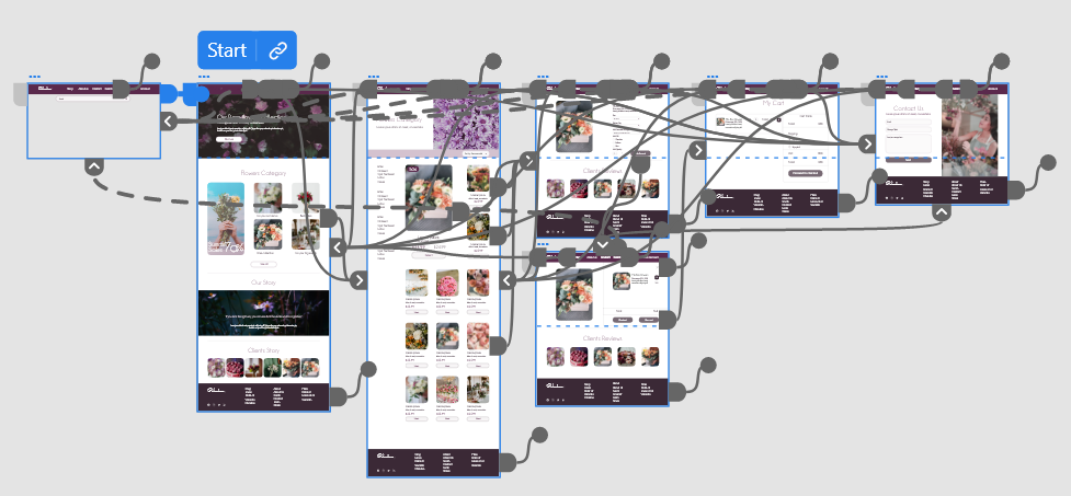
The hi-fi prototype followed the same user flow as the lo-fi prototype, and included the design changes made after the usability study.
Accessibility considerations
I insisted on the consistent use of components with the same functionality to help users identify components on different pages with desired functionality. So People with difficulty reading text are highly benefited from this.
I used descriptive and informative page title. Page headings and labels. This can help users with limited short-term memory, low vision or difficulty reading text — they can see only few words at a time and know the purpose of each section.
I tried to use a combination of text, colour to help users with partial sight or limited colour vision, colour-blindness and for users who use text-only, limited colour, or monochrome display screens.